
OUR GENERATION DOLLS
When Our Generation wanted to rebrand their doll line with no marketing budget, we knew from the beginning the only place to deliver a brand story would be through the packaging and a website where girls could play. Every square inch and every pixel had a job to do.
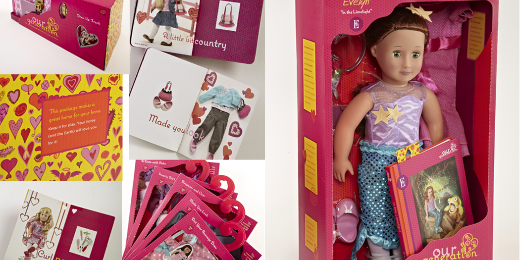
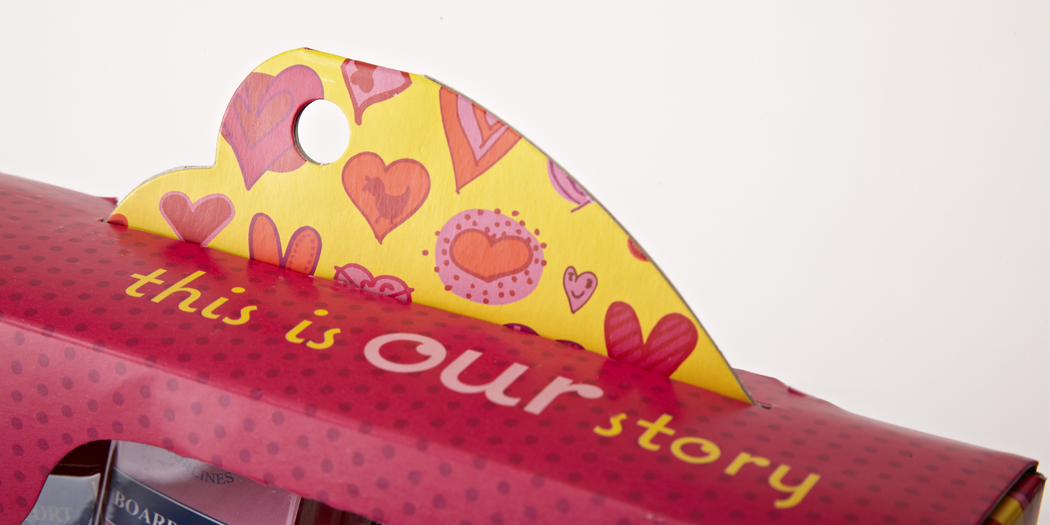
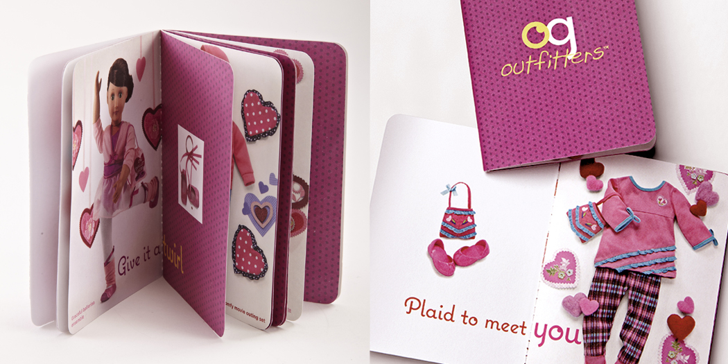
My partner, Amy Flanagan, and I started by creating a brand around the line’s strength, that every doll came with a chapter book about her. The brand would celebrate that bond between doll and girl. That became the rallying cry: “This is Our Story”.

Along with a broader team I was in charge of concept, creative direction and design of the OG website. We built all of our thinking into the experience and design of a fashion-forward interactive site that invited girls to play with games, lookbooks, polls and a little bit of grosgrain ribbon. See the site here.
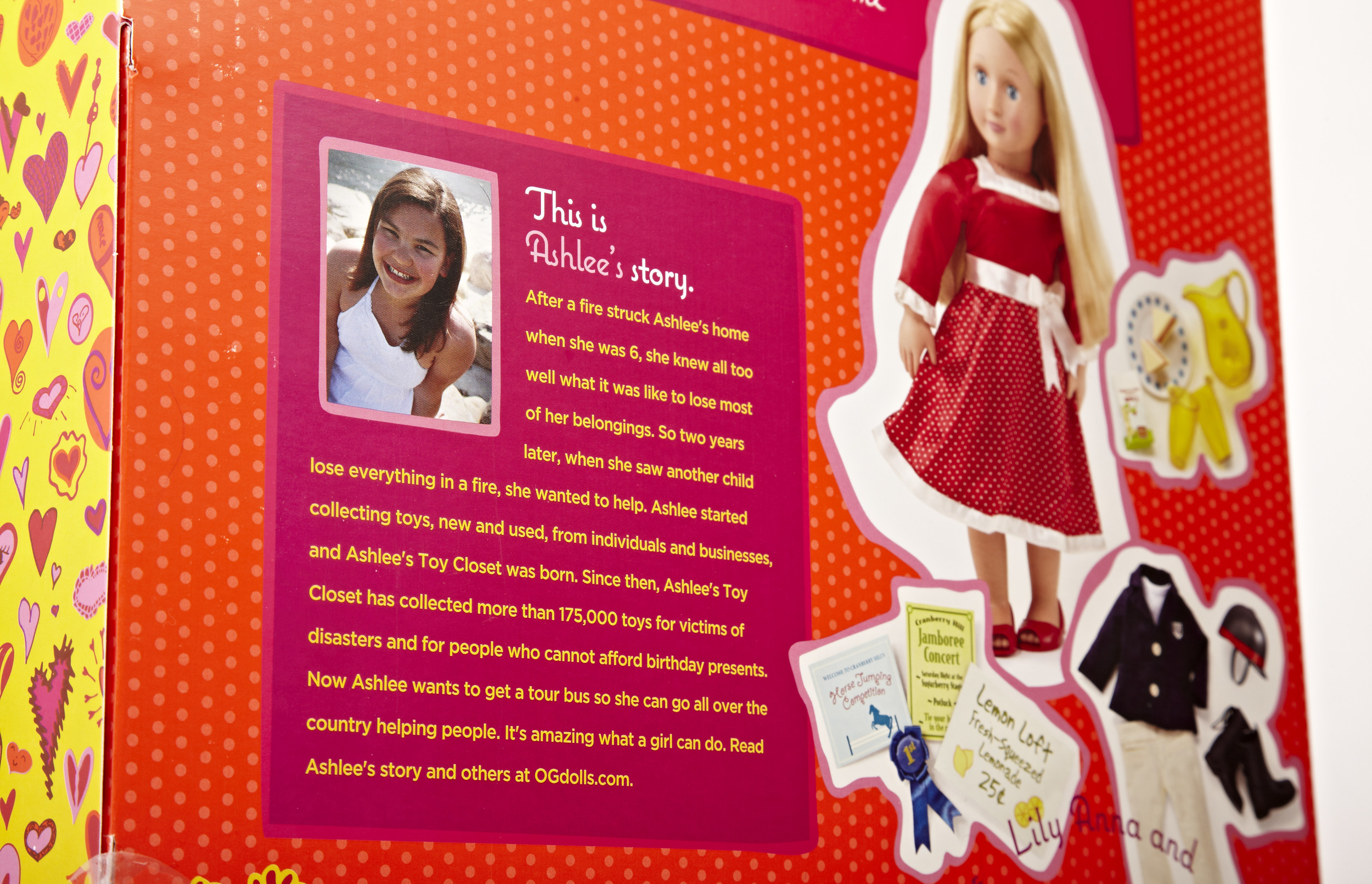
We created a community between the doll, the girl who played with the doll and the collective consciousness of girls across the country. We carefully chose girls who were the embodiment of everything this wholesome brand stood for and put them on the packaging and the website. We invited users to nominate more girls for the web showcase and to be placed on future packages.

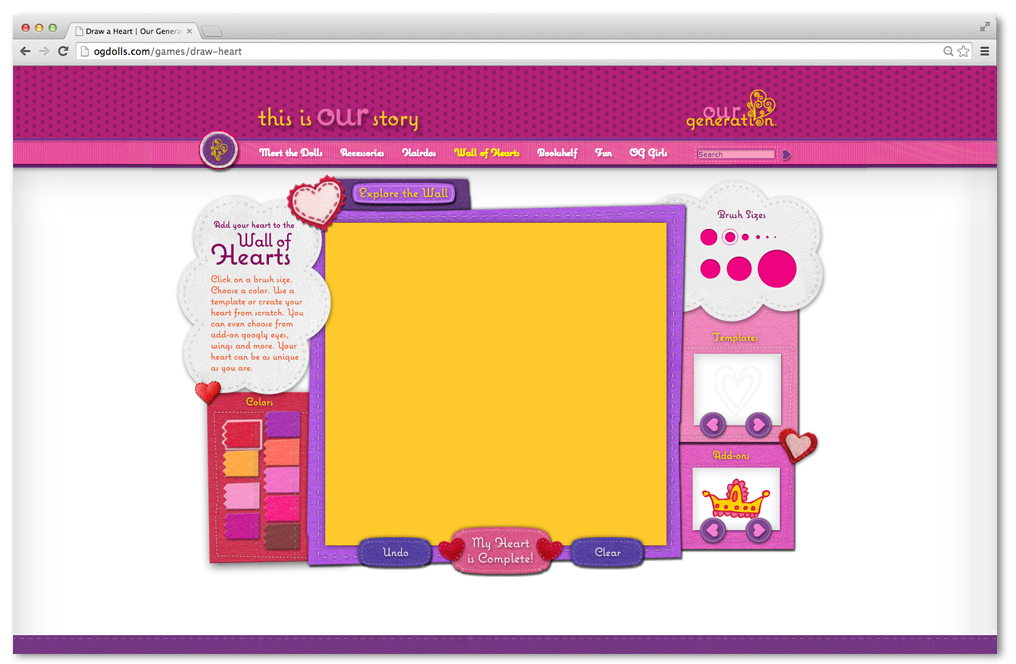
We built of a "Wall of Hearts" on the site, where girls could draw a heart that went up on the Wall and could be shared across social media and emailed to friends and family. We curated these hearts into a wallpaper design for the packaging.
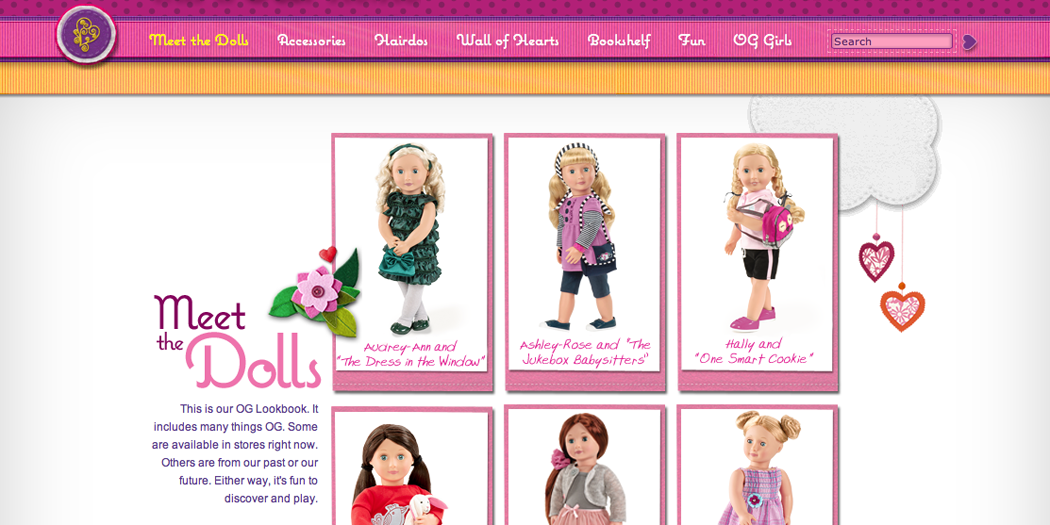
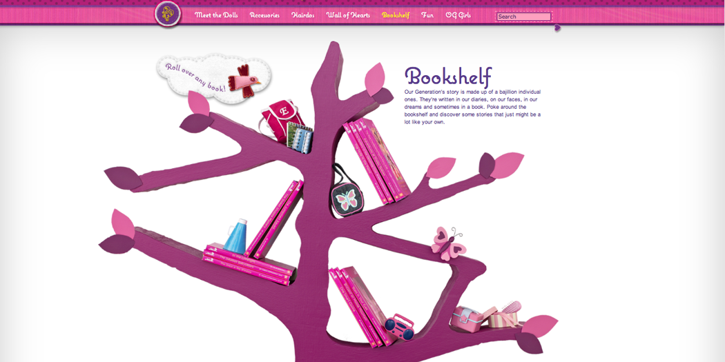
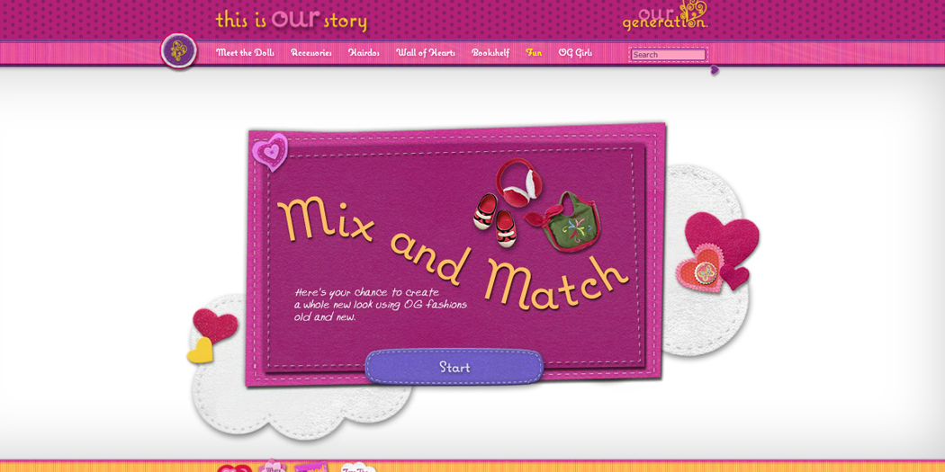
MORE SITE PAGES!
BRANDING USING OUR MEDIA BUY: SHELF SPACE

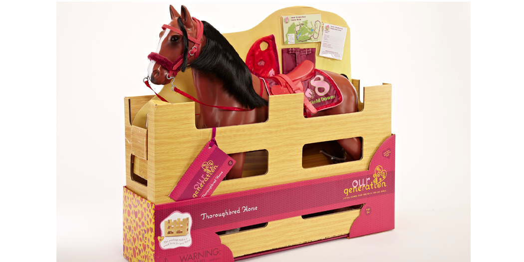
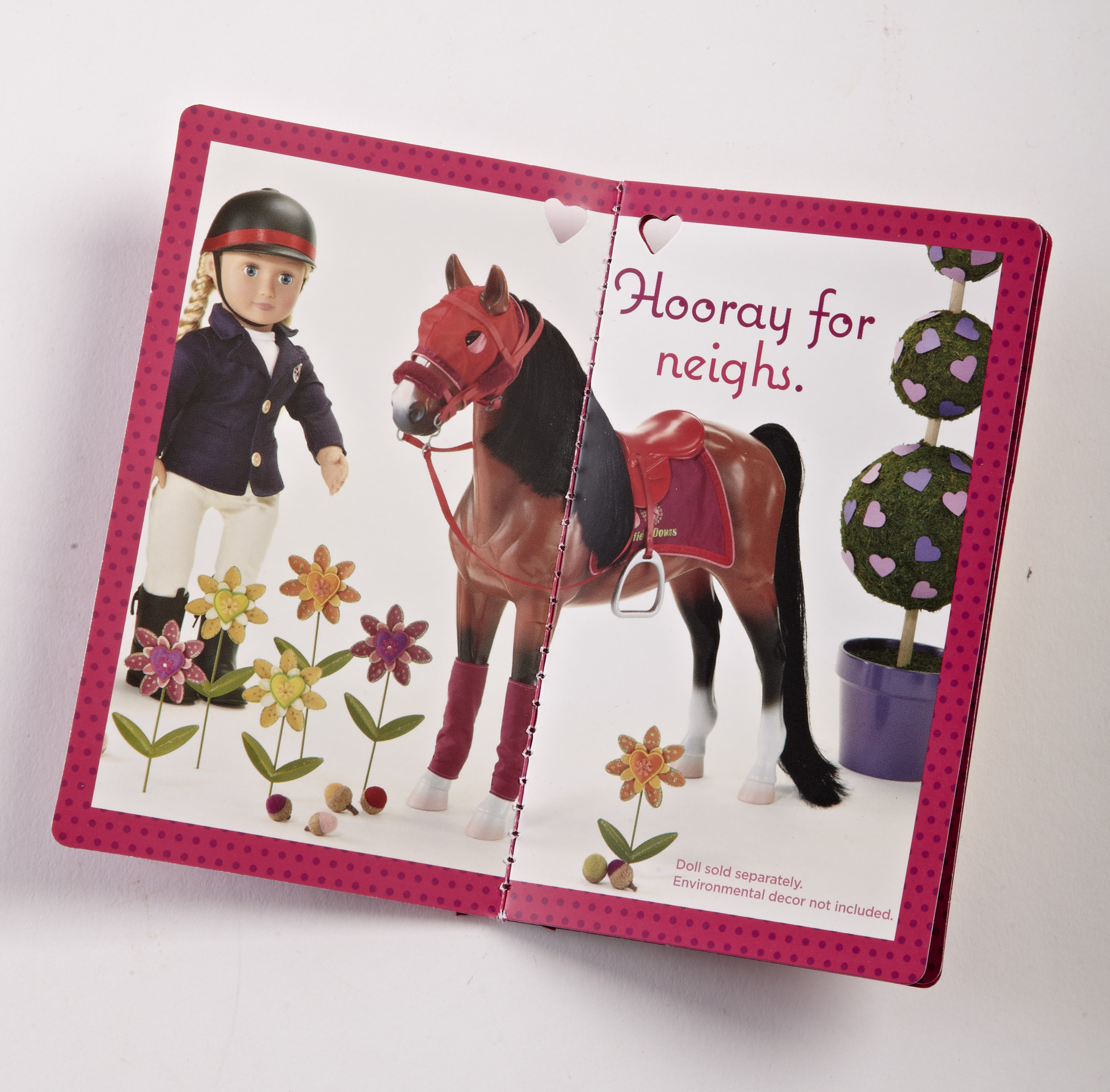
Creative direction and design of the logo, trade dress and packaging used a color palette that was bold and bright, with an emphasis on warm colors. Dielines were hand-drawn to reflect a flowing illustrative sensibility and a custom typeface with whimsy and a storytelling flair completed the look. The project included shooting hundreds of dolls and accessories and creating a style guide for the client to maintain the brand in-house.

The crowd-sourced OG Wall of Hearts on packages.
A CLOSE UP LOOK AT THE TRADE DRESS
The year OG introduced the new branding, sales grew 170%. Based on the success, the dolls and accessories have since been updated to reflect the branding and fashion forward aesthetic. And they continue to climb.